Every day we see “color” all around us, but the perception of that color changes based on changing parameters. An object will appear to have a different visual perception to each person depending on the object’s material composition, surface texture, and the type of light directed at it. Color is what we see when light is reflected from an object at a different wavelength and then our brain interprets these signals as what we describe as color. If an object appears white it is due to that object having the absence of all color as it reflects all light. If an object appears black it is due to that object having the presence of all color as it absorbs all light.
White light has all colors within it, which includes red, green, and blue. What wavelength an object reflects is dependent on the light source. When looking at plastic parts, the type of light above your work station can have a large effect on what you see. Whether a light is D55, D65, F2/10, halogen, or LED can change visually what is being seen.
Kelvin:
The “temperature” of a light is referred to as Kelvin. This scale is used to let you know the look and feel of the lighting. The scale goes from 1,000K to 10,000K. The lower this number, the more yellow it appears. The higher the number, the more blue. Natural white light is around 5,000-6,000K. D55 lighting is at 5500 kelvin and D65 would be at 6500 kelvin.
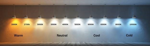
Picture source: https://www.ledlightingwholesaleinc.com/Understanding-Lumens-vs-Kelvin-s/399.htm
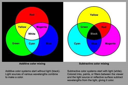
Additive and Subtractive Color:
Knowing the light source you are using is extremely important as objects may absorb a specific color. For example, a shirt appears yellow (red and green light) because it is the only color that is being reflected. The rest are absorbed by the shirt. This means that blue light is being absorbed causing red and green light to mix and appear yellow. However, if that same shirt was to have cyan light directed at it, it would appear green. Cyan Is the mixture of green and blue light. As the shirt absorbs all blue light, only the green remains.
As color absorption goes, yellow absorbs blue light, while cyan absorbs red light and magenta absorbs green light. This helps show why the type of light, and the temperature color of that light, can influence the final appearance of a plastic part or any object.
Using Spectrophotometers and LAB values:
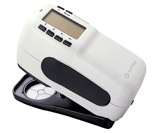 The X-rite is a common tool used here at Mack to help measure the color of the plastic part. It is important to know what these values mean. The model used here at Mack is like the photo shown to the right. It can be set to measure single points on a surface or compare two parts against each other. The light source standard used at Mack is F2/10 lighting – a cool white fluorescent that is common office room lighting.
- L – refers to the lightness of the part ranging on a scale of 0 to 100. 0 is pure black (dark) and 100 is pure white (light).
- a – refers to the red-green range. A negative “a” value is green while a positive “a” value is red. 0 is neutral and unlike the L value, “a” has no defined range limit.
- b – refers to blue-yellow range. A negative “b” value is blue while a positive “b” value is yellow. The higher the “b,” the more yellow it is. Like “a,” “b” also has no defined range limit.
- ∆E – is a way to combine all three values together to compare to another standard. If comparing two samples, ∆E can give you an overall difference to help determine if the sample is close in color to the standard. Limits can be set depending on the application. The closer to 0, the closer in color. Generally anything over a ∆E of 2.0-3.0 can be differentiated by the average human. Less than a 2.0 is considered to be a very close color match but again is dependent on the chosen standard by a company and their application. However, just because the ∆E is under 2, this does not mean that a person still cannot see the differences between the two samples. It is a complex formula taking into account all three numbers in LAB. A 1-point difference in one value may not be as easy to tell apart in another value.
Discerning Color:
Every human sees color differently. Not every person should be allowed to make decisions on color matching as some humans can differentiate color better than others. There is a standard test referred to as the Farnsworth Munsell 100 Hue test. This will test your ability to perceive colors in the correct order based on hue. The example below shows 4 lines of colors which must be placed in order from one end to the color based on the gradual change in hue. They gradually change color to match the stationary block at the most left or right of the row.
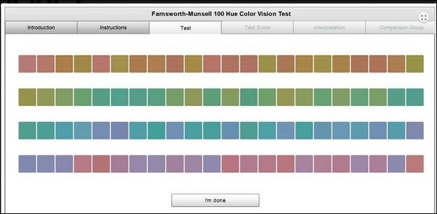
The score is based on how many are in the correct order and how long it takes that person to complete the test. A score of 0 is a perfect score. The higher the number, the more difficulty a person has with differentiating color. If you would like to take a basic test (not the full test), you can find it using this link: https://www.colorblindnesstest.org/farnsworth-munsell-100-hue-test/.
Color Matching Resins:
A number of factors are considered when trying to determine the color required for a specific resin. A color pellet can be manufactured to match a color chip or a color number, such as a PMS number. However, the same color pellet may not be usable for each type of resin or result in the same color. Things such as viscosity, melt processing temperatures, gloss, filler content, and chemical conditions must be considered when developing a colored resin.
When a color is matched, the resin can come in two forms. Resin can be pre-colored, or it can be a cube blend. A pre-colored resin comes ready to run as the pellets are already the desired color. A cube blend uses raw, natural colored resin and is mixed proportionally with colored pellets called a Masterbatch. These two methods will not necessarily be the same when processed but is useful to get color match samples from the supplier for the method you intend to use.
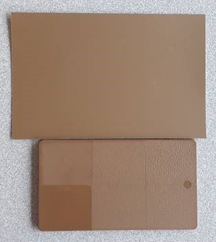
In general, plastics should be able to maintain a delta E of 3 and below. For example, the image below shows a standard color to a color matched plastic swatch. Each square has a different texture but all squares fall with 1.5-2.0 of delta E values.
For more information this or any of your plastic injection molding needs, please feel free to reach out to us!

This tech topic was written by Matt Woodard, a Tool Design Engineer in the Application Development Center at Mack HQ. Woodard is experienced in process engineering, quality engineering and production. Prior to Mack, Woodward was a process engineer for CY Plastics in Honeoye, N.Y., where he priced new molds and served as a liaison between mold makers and customers during the mold design process. He has a bachelor’s degree in chemical engineering from The Rochester Institute of Technology in Rochester, N.Y.